
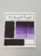
Dark & Stormy Palette
- Stacey Dodd
- Aug 29, 2019
- 4 min read
Updated: Sep 6, 2019
Hello and welcome!
Today will be ALL about the new Dark & Stormy palette. Such a fabulous collaboration with Jenni from @secondjenletters. There are four colors in the set. All originating from Jenni's very clever and creative brain. She guided me with colors and named the set and individual colors.
Smouldering Thunder - Torrential Rain - Midnight Purple - Hurricane Twilight
In this post I will unpack each color and explain what pigments were used for each color and how you might achieve these colors using your own paint supply. You may not get the exact shade, but an approximate shade is good enough!
Midnight Purple.
Midnight Purple is a single pigment.
Pigment: Dioxazine Violet
Classification: Synthetic Organic
Colour Index: PV23
Most palettes come with this color or a form of purple.
If you do not have a Dioxazine violet, you could add a little bit of black to a purple.
If you do not have a purple, then blue + red and add a little bit of black to darken it.
This pigment is very fine like that of Prussian Blue or Phthalo. It needs about a ton and half of binder. It really needs a lot of moisture. It is prone to cracking if there is not enough binder or the climate is quite dry. It will go gluggy on the slab and this is your hint to add more binder. It won't take kindly to being stored in a syringe. Best place being an airtight jar.
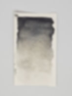
Torrential Rain

Torrential Rain is a combination pigment.
It combines Antwerp Blue and Slate.
Pigment: Slate
Colour Index: PBk19
Hiding power: Opaque
Pigment: Antwerp Blue Pigment. (Prussian Blue mixed with Blanc Fixe (Barium Sulphate)
Colour Index: (PB27, PW22).
Hiding power: Transparent.
Lightfastness: Good
To achieve this color, you would need a semi dark blue and grey. You can mix your own light grey by adding a touch of black to white. You can mix your own darkened blue by adding a touch of black. Ensure that you have more grey than blue mixed. The blue will easily overpower the grey. You want to achieve a teal like grey.
Antwerp Blue is a beautiful pigment to work with. It is creamy and binds well. It doesn't appear to require extra binder and sets well. The Slate pigment is grainier and requires ample binder in order to prevent rubbing off the paper. I would recommend not too much Antwerp because it will overpower the slate pigment.

Hurricane Twilight
Hurricane Twilight is a triple pigment combination. It combines Indigo, Slate and Black Iron Oxide.
Slate is mentioned above.
Pigment: Indigo; Synthetic from Kremer.
Colour Index: VB1
Hiding power: Transparent
Lightfastness: Moderate
Pigment: Black Iron Oxide
Colour Index: Pigment Black 11 (77499)
Hiding power: Transparent
Lightfastness: Good
To achieve Hurricane Twilight - you need to mix indigo, black and slate (grey). You need only a small amount of black to dull out the blue in Indigo. Too much black and it will kill the indigo.
If you do not have the color Indigo, it is a mix of blue and purple. Recommended amounts are 1/4 purple and 3/4 blue.

I really enjoy working with Indigo pigment in it's synthetic form. It requires ample time for mulling and it sets extremely well. It doesn't tend to require a ton of binder but being generous with the binder is okay too. If you are prepared to work with Indigo, set aside an hour plus or more to mull even a small amount. It mixes well and it is apparent when mulling, when to cease.
Mixing these 3 pigments together and getting the balance right is not easy. It requires a lot of swatch testing and seeing how it dries. You do not want to see a straight indigo.You want to see grey peeping out when diluting with extra water.
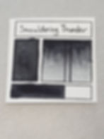
Smouldering Thunder
Smouldering Thunder is a triple pigment combination. It combines Indigo, Slate and Black Iron Oxide.
You read that correctly. It is exactly the same pigments as Hurricane Twilight but the measurements of each are different in order to achieve a different hue.
To achieve Smouldering Thunder - you need to mix indigo, black and slate (grey). You need a larger amount of black in relation to the indigo. Too little black and the color will be more like an indigo. You want lots of grey so that you are achieving a dark grey with a hint of blue. It's very subtle.
Again, getting the balance right and avoiding it turning into Hurricane Twilight requires having a dominant amount of black and grey and only a small amount of Indigo. Indigo can be quite a strong pigment even though it is transparent in quality. You want to test this pigment combination thoroughly and you want to see the grey peeping out, once dried on the paper.
On it's own, I enjoy working with Black Iron Oxide pigment. It is creamy and mixes well with the binder. It doesn't always set well so ample binder is needed. It can require 4 or more pours when filling a half pan. Storing extra made up pigment is recommended.
When mixing these 3 pigments together, they set really well. I have Indigo to thank, as it sets so well.
Ensuring that Smouldering Thunder and Hurricane Twilight are mulled long enough and tested for rubbing off the paper. This would be the slate pigment that is grainier and responsible for this. It needs ample binder to prevent this happening.
I really hope that you were able to gain an insight and maybe learn something new about a pigment or 2 or how to achieve these colors without owning them. Mixing your own colors can take longer but it is a great lesson in understanding color theory. I personally prefer not to spend time mixing colors for painting purposes - I prefer to have the right shade available at said time. This is my preference. I learn a lot of my color theory through mixing pigments instead.
Feel free to leave a comment below telling me something NEW that you read today or maybe it was an affirmation. I LOVE your feedback!
Again, special thanks to Jenni for her AMAZING creative brain.
Stacey.